Module Reflection- I&DV

This module has been a tricky one for me as it is there were times when I really struggled and times when I felt more comfortable with modelling.

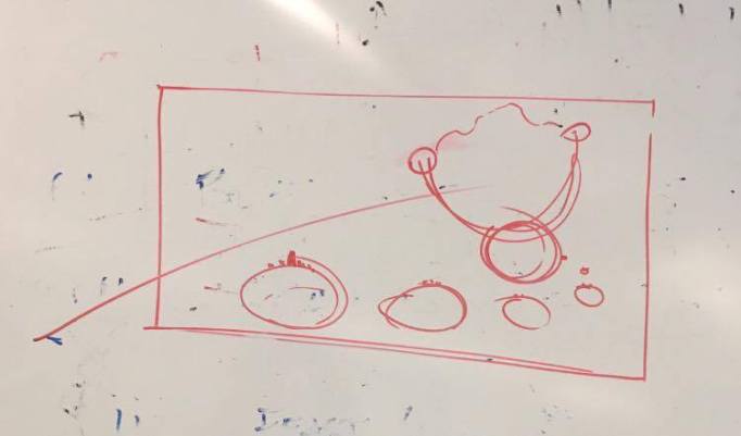
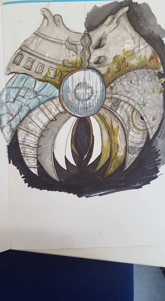
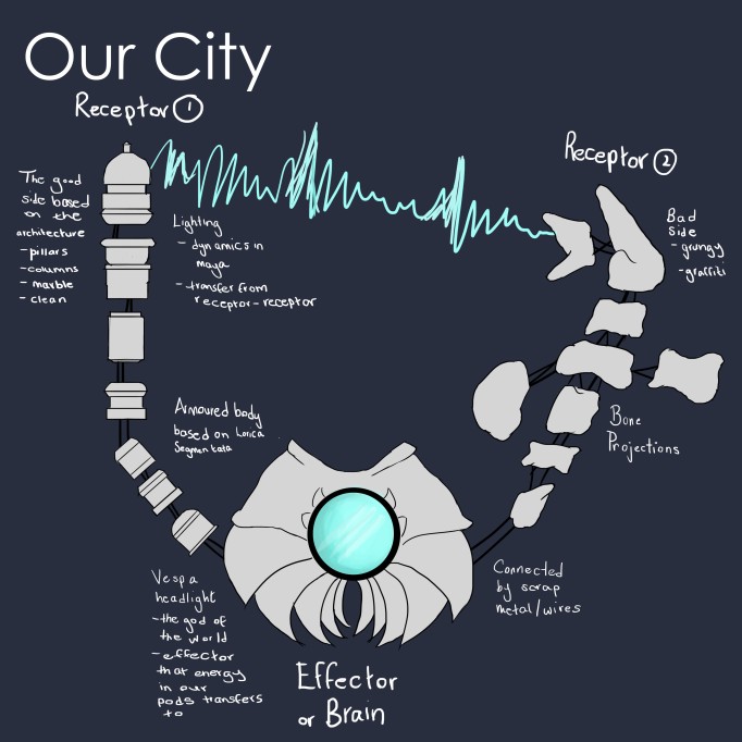
For Floating City I was very unsure about modelling, especially with the more organic bone structure we created. Looking back, I probably should have looked at z-brush to create a more bone look to the world- to create one closer to our designs. We also were very rushed in this project, due to the intense New Narrative’s Vogler project running at the same time (worth the same amount of points). I found the research in this project very interesting and glad it was changed to Rome, rather than Belfast. It allowed for a bit more cultural understanding and a totally different outlook on which things would influence the world itself (the culture, architecture, religion etc). This project allowed for us to go a bit insane too, allowing for me to introduce some of my own science research into the creation of energy in the body and how this could be applied in our world itself. If I was to go back and redo this project I would familiarise myself with lighting a bit better as the final outcome was definitely not what was anticipated in how it was show to the audience.

The head model, for me, was very enjoyable and something I would definitely try again, with other people as references, to see how different face shapes effect the topology and the skin folds. It taught me a lot of simple modelling techniques and how in animation a lot of the topology is created with science in mind- in this case, following the facial muscles. I found it a lot to match my face with the correct topology that create the floating city, which is strange as one is a lot more complicated. I found the research for this model very interesting as well- looking into some of the face models with such high detail and good shape with very little topology or being low poly. I tried to follow this in my own face. Modelling the head also allowed me to have a bit more confidence in the modelling itself. Areas like the neck where my tutorials did not cover I found myself having to improvise and create my own model based on several topology flows I had found online.


Camera Angle/Lighting For Ryan

Ryan was the one responsible for the camera in our world, we roughly sketched how we wanted to world to look when rendered to show for size. We agreed with Conánn’s advice and wanted to use objects of a known size, put in our frame, to re iterate the size of our world.

new light_test1 _rim light

I can’t draw light and this was a really quick paint to show what I meant to Ryan. I really was inspired by the framing of the ship by Kubrick in 2001 Space Odyssey (1968). We want the camera to remain in place, however, have the planet move upward, creating a halo of light on the destroyed Earth (the giant grey blob at the bottom of the shot).


Our First Presentation

So, our first presentation for the city project went pretty well, however, Ryan, Eoin and I agreed that there were a few things we could change for our hand it.

Conánn said that our scale was off i.e.we did nothing to show the actual size of the world. He drew the following image to help us picture how we could demonstrate its size. He suggested that we place objects of familiar sizing, such as other planets, around the floating city.

13153278_10201683838175726_1761191003_n

Conánn’s diagram to help explain things further.

We will do some more research in hope to improve when we film the world.

Our city. Yeah it’s a little bit dodgy.

Research- Refilming World

From the feedback for our world, it was mentioned that we had no representation of scale. We decided it would be best to re-film our world to make it look a lot more believable.

I also mentioned the idea of adding lighting to make it look more light a light-house effect. This  effect would look amazing, especially as the world turned towards the camera, momentarily blinding the viewer. This technique has been used in several movies before;

The Lovely Bones.

The Lonely Bones lighthouse scene. (The Lonely Bones, 2009).

I love the progression in lighting from the lighthouse to the street light is incredible. The blinding light changing the scene from the previous to this one.

The Great Gatsby. 

The beginning and end scenes from The Great Gatsby. (The Great Gatsby, 2013).

Another movie I have a soft spot for. The cyclical structure of the green light, a symbol for Daisy. The opening lighting scene, though from far away, gives an amazing atmospheric feel, giving the idea of importance in the light.

I love the opening book scene- could this be something we could experiment with? Maybe the project name on a classified file blending into our own scene.

Hot Fuzz.

The lighting cues from Hot Fuzz. (Hot Fuzz, 2007).

Another reference, prominent on my blog, is the Hot Fuzz movie. The lighting cue as the spotlight reflects on the nerd’s glasses is reminiscent of a Police spotlight.

This would look quite nice in our own project- I had previously mentioned the use of the a search light, possibly looking at the destroyed world below.

A brief sketch idea (at Ryan Beatty’s request). 


References

The Lovely Bones (2009). Directed by Peter Jackson [FILM] USA: Orion Pictures.

Hot Fuzz (2007). Directed by Edgar Wright and Simon Pegg [FILM] USA : Studio Canal.

The Great Gatsby (2013). Directed by Laz Luhrmann [FILM] USA: Warner Bros. Pictures

Research- Filming Our World

I wanted to have a look further into how some of the low angle and close up shots are applied to give a better feel of size to the world.

Space Odyssey.(YouTube, 2016).

Yuan showed us this trailer for Space Odyssey to look into the different feels and viewpoints of space film- looking at the sub genres that exist within the genre of ‘Sci Fi.’ The shot showing the space ship rotating is the part I wanted to look at closely- the ship fills the whole screen, the slow rotating emphasising the size of the world itself.

This Universal opening sequence was another that I looked at. (YouTube, 2016). 

The Earth itself starts as a zoom in from the top, panning down and then out, with the rotation of the Earth itself. I thought this would be something we could look into for our own world, given the way our concept rotates.

The Wall-E opening sequence.(YouTube, 2016).

Pixar’s Wall-E implies a different method to show the size of the world, or at least portray this into the audiences mind. It shows the solar system at the start, to give a familiar viewpoint to the audience and to also show that our own Earth is the setting, and not a fictional planet. The zoom into the planet is the reverse of that in Space Odyssey, it is fast, showing the debris of satellites around the world, emphasing how polluted it is.

The Space Incident from Gravity. (YouTube, 2016).

Although not specifically focusing on the planet, I love how the comparison of size of the Astronaut to the satellite as it is destroyed. The characters look like tiny plastic dolls against the debris flying among them. It gives the feel of the omniscience as they astronauts are helpless against what is unfolding around them.

Hitchhiker’s Guide to the Galaxy- Planet factory scene. (Vimeo, 2014).

This is another scene I thought really helped with showing the perspective of the world- through the application of other props/ items of known size (like people themselves). The entrance into the factory at 3.40 mins shows this perfectly as the characters enter the factory, growing smaller as they move closer to the planet in front.


I showed the other members of our team these references and we agreed that the visualizations used in the Space Odyssey trailer would work best with our world.


Reference

YouTube. (2016). Wall-E Opening Scene. [online] Available at: https://www.youtube.com/watch?v=vx-4Hz_W-TY [Accessed 24 Mar. 2016].

YouTube. (2016). Universal Pictures – Intro|Logo: New Version (2013) | HD. [online] Available at: https://www.youtube.com/watch?v=eXRsNYKc-Xk [Accessed 24 Mar. 2016].

YouTube. (2016). “Gravity” continuous shot. Opening Scene. Space debris hits Explorer. [online]

Vimeo. (2014). Hitchhiker’s Guide to the Galaxy – Planet Factory Floor. [online] Available at: https://vimeo.com/109836809 [Accessed 24 Mar. 2016].Available at: https://www.youtube.com/watch?v=vKW-Gd_S_xc [Accessed 24 Mar. 2016].


Research- Camera Angles

When filming our world to show to the class, we realised that we wanted to make it look large and mysterious. To create this, we realised we would need to look into other camera angles and methods to do so.

Low angle in film gives the look of an object or subject appearing larger than what they truly are. It adds height to actors (such as James McAvoy and Tom Cruise) and gives a feel of speed in motion. It is used to disorientate the viewer- making them feel powerless to the object before them. It gives the feel of power and ominous to the item the person is viewing, like a child looking up at an adult. (Moura, Deaver and Moura, 2014).

This techique has been applied many a time in film itself.

Intimidating Nurse- Scrubs.(YouTube, 2016).

Yuan showed this example to us in a lecture in class. Even in comedy this angle is applied rather well. As Carla takes her anger out on the delivery man in front of her he gets smaller, as the camera angle gets higher. Carla, however, gets larger, as she tells him off more, reminiscent of a parent telling off a child. 

Death Sentence starring Kevin Bacon. The low shot in this is used to emphasise the character confusion in the scene, the panic and superstition high as the siren sounds behind him. (YouTube, 2016).

Skip to 3.07minutes to see the low angle example. (YouTube, 2016).

This clip taken is very similar to that of the Inglorious Basterds one (below) . It puts the viewer as the person in the trunk- confused as they daylight spills onto them, after a presumably bumpy ride.

Citizen Kane clip. (YouTube, 2016).

The low angle in this scene is used in a more intimate way- not through a POV. It shows the serious tone to the conversation the characters are having.

Inglorious Bastards- Head Carving Scene. (YouTube, 2016). This is one of my favourite movies and this is also one of my favourite scenes. The low angle is applied at the end of this clip- when both Donowitz and Raine are carving the Nazi soldiers head. Tarentino has put us into the POV of the soldier themselves, looking up helpless to the men above. It gives such a feeling of weakness as we are defenceless like the soldier. 

References

Moura, G., Deaver, J. and Moura, G. (2014). CAMERA ANGLES: the Art of Manipulation. [online] Elementsofcinema.com. Available at: http://www.elementsofcinema.com/cinematography/camera-angles-and-composition/ [Accessed 24 Mar. 2016].

YouTube. (2016). Use of high and low angle shots in “Scrubs”. [online] Available at: https://youtu.be/8V1uE1-wTPs [Accessed 24 Mar. 2016].

YouTube. (2016). Death Sentence – Leave building – LOW ANGLE – OBLIQUE. [online] Available at: https://youtu.be/_NgQwRhlTck [Accessed 24 Mar. 2016].

YouTube. (2016). Top 20 Amazing Cinematic Techniques Part 1.. [online] Available at: https://www.youtube.com/watch?v=O3EnnBDgMww [Accessed 24 Mar. 2016].

YouTube. (2016). Citizen Kane – Low-Angle Discussion. [online] Available at: https://youtu.be/qTlbCCASW_A [Accessed 24 Mar. 2016].

YouTube. (2016). Inglourious Basterds – German Traitor Scene – Full HD. [online] Available at: https://youtu.be/B-CdSuFZj1s [Accessed 24 Mar. 2016].

Creation- The Vespa Light

When deriving our final main body design for our world, we had a giant Vespa light acting as the deity of our own world. When looking into the religion of early Rome/ ancient Rome we came to realise that they didn’t particularly have one set of values. Instead, their religious beliefs were a mix of ones they had inherited, sharing many of their Gods with that of Greek culture.

world front

Our World in all its glory…

We wanted to play on this with our own world- having a God enforced onto the city of Rome that, much like current Roman beliefs, around 98% of the city would follow. We decided to have a representation of this God for the people, something powerful and beautiful- much like the light itself. This Vespa light was going to have to serve a purpose to the world- in our apolitical energy shell, it would be the source of control in the planet. The brain as to which all the signals were sent to. It would control how much energy was brought to it as stored by the pods on the spine at the sides.

The Vespa light is an iconic Italian motorcycle- however it is was partially owned by a British company. In 1907, the Douglas Company of Motorcycles of Bristol started making motorcycles, but by 1948 was bankrupt. That same year, Managing Director Claude McCormack saw the Vespa and made arrangements with owner Piaggio to contract builds of the motor vehicle in Britain. These motor cycles, however, proved to be slightly out dated to the Italian counter parts, as they were built based on mass production rather than aesthetic. (Veteranvespaclub.com, 2016).

We thought this had quite a good application to our own world. The Roman’s believe in the saying ‘Caput Mundi’ which literally means capital of the World. Roman culture basically states that Rome is the best and no one else can compare- and no one will defeat them. However, over time, different cultural aspects and different deals have resulted in the world becoming tainted and not as pure. Could this show that some day, even Rome’s escapism from the dying world will kill them?

vespa-lxv-125-02

When modelling the bulb I decided to look at that of the Vespa 125 model- a British built bike. I thought it would be interesting if there was a flaw in the world that would be hard to miss- the so called Roman God they were praying for was actually British made. (Picautos.com, 2016). When creating the model itself, I decided to opt to leave the ledge that exists around the bulb as it would not fit against our design. 

I modeled this bulb and so looked into a few references as to how to make the basic shape of it.

2016-03-28 (1)
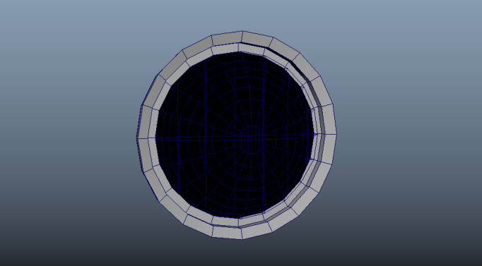
The first stage of the light showing the modelling geometry. I then selected the center that acted as the bulb, putting a transparent material on it.

The light bulb tutorial I used for my work. (YouTube, 2016).

Now, I am a woman of simple means and am easily confused so was very thankful for the tutorial (above) that I used to add the glow to the light bulb itself. We wanted the glow to be super strong, to act like a deterrent to anyone who tried to land on the city. The light would be too bright to allow a safe landing.

2016-03-28.png

The final bulb glowing out at the world.

References

Veteranvespaclub.com. (2016). Veteran Vespa Club UK. [online] Available at: http://www.veteranvespaclub.com/1008.html [Accessed 28 Mar. 2016].

Picautos.com. (2016). [online] Available at: http://www.picautos.com/images/vespa-lxv-125-02.jpg [Accessed 28 Mar. 2016].

YouTube. (2016). How to make objects glow in Maya 2013. [online] Available at: https://www.youtube.com/watch?v=CijESEporUo [Accessed 28 Mar. 2016].


Maya- Creating the Main Body.

When modelling the main body of the world I had to start again. Twice. Like I said, Maya and I have a complicated relationship. Thankfully, Alec was there to save the day again.

The indents in the Sacrum were proving problems due to the fact that the faces were inverting and overlapping as I had to extrude inward. This was creating a mess when smoothing out the object itself- it was a mess. Alec showed me an alternative way of creating these ridges, preventing them from messing up again.

Alec also suggested I keep the world as low poly as possible as this would help when creating the textures for it- working out the UV map for multiple faces would be quite complicated.

I simplified the body from the original design as I found adding the ledges was proving quite difficult.

2016-03-29
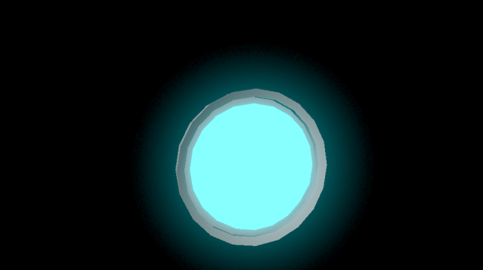
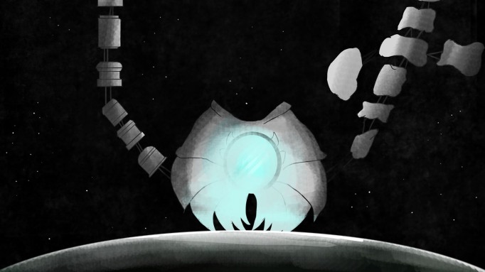
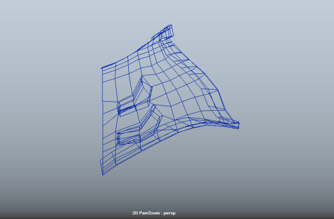
The wire frame of our world. This was the second attempt and the successful one used in our world.

2016-03-29 (1).png

The shaded version before Ryan added the textures to it.

Our Final World

I wanted to create a final silhouette of our world- inspired by some of those that Niamh had previously done for her own group. I found these silhouettes really helped understand the need for scale and the actual alignment itself of the world around it.

whole concept

As you can see, there are several key features inspired by all of our past research- the most influential being that of the architecture and military of Rome, both the ancient and modern city.

Eoin is taking the more intricate spine with the Upper class levels- he is our best modeler and well do them more justice than I could ever do. We collaboratively looked at the different areas of architecture unique to Rome, such as the use of arches, columns and even the white cement used on many of the buildings.

Ryan opted to take the bone projections on the lower class side to the world, as his research into the graffiti and the art movement behind this was very influential in our textures. He also wanted to add some effects to the world and ,with the idea of lightening being used to demonstrate how energy moves throughout our floating city, I thought this tutorial below showed this idea perfectly. I had a go myself at creating the lightening as a test and showed Ryan. He was then able to put this into the city itself, between our two ‘receptors.’

I took the main body of the world, as it was a bit easier to model and I am still struggling to use Maya- one day, one day. Ryan did help me model parts of the piece, as trying to model the indents as found in the Spinal region we based our design on (the Sacrum). The overall armour of our world was inspired greatly by Roman army and its rise to power. We looked extensively into their armour and weapons, to see how to best protect our world. We also researched how these exoskeletons are applied in nature itself, like in invertebrates. Our final idea has this large Vespa light planted in the center of the world- the main deity and effector and brain of our world. I modeled and gave the glow off the bulb- I wanted it to be a strong blue, inspired by the work of Zdzislaw Beksinski, whose work we were heavily influenced by. His glowing blues on the inner world gave a beauty to quite a horrific looking piece.